Level Up Your Data Storytelling with Animated Bar Charts in Plotly

Plotly supports an excellent foundation for animated plots. I highly recommend their basic tutorial here. However, plotly animations are primarily set up to add another dimension to the visualization – usually time. This is fantastic for adding more meaning to a plot.
Animation, however, doesn't have to be used to add complexity to a plot. The ability to emphasize with animation is powerful. When we have the pivotal graph for our audience, we want to pull in their attention without explicitly shouting "This is the plot you should really pay attention to!" Our eyes are naturally drawn to things moving, and animated plots can have a way of building up anticipation. Your audience engages and mentally tries to anticipate next bar or line in real time. Imagine if key business decisions hinge on this plot – your audience waits with baited breath while the results unfold before their eyes!
To put it in perspective – imagine you're 20 minutes into a colleague's presentation – which graph grabs your attention? This simple (pandas-generated) graph:

Or this animated graph of the same data:

Building in Plotly
To pull this off in Plotly, we actually have to reshuffle our data a bit. Again, Plotly animations are set up to step with some sequence (usually time). So, we're going to stretch our data to effectively make a frame for each data point. Here we go:
First, let's import the plotly package (install with pip if you haven't already), and create a dummy data set to work with:
To use Plotly's animation directly, we'll need to augment our data set into this:

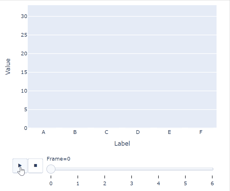
We'll want to effectively stack copies of our dataframe, with the number of copies being the length of our original dataframe. With each copy, we'll want to add a Frame value to set its sequence in the animation. Where it gets tricky is that we want more bars to appear with each step of the sequence. We want to start with no bars showing on our plot, so for the first Frame we'll set all of the values to 0. Then, on the second Frame we'll set all of them to zero except the first data point (A: 10). This method continues until the last Frame (Frame #6 in this case) shows all of the values from our original data.
At this point we have set up individual "Frame" elements for Plotly to smoothly animate between. Note that we are not coding every frame of the animation, we simply are snapshotting the final value for each Label, one-by-one, and letting Plotly fill in the blanks. Now we just need a helper function so we can apply this transformation concept to any simple dataframe:
In this code, we start my creating our blank destination dataframe, which will be the returned output. We loop through for as many times as there are elements in the passed-in dataframe – range(len(starting_df)+1). We add 1 here, as the first Frame will have all values zeroed out so that our plot starts out empty. Within the for loop, we start with a deep copy of the original dataframe. This means that changes we make to this copy won't propagate back to the original. On this free-and-clear copy we add a Frame value, and zero out some of the data points, depending on which loop we're on. Finally, we can add this copy to the end of the final dataframe we're constructing.
Plotting
From here we're ready to start plotting. If we just use the stock plotly function, it looks something like this:

As you can see, it gets a little wonky at the get-go. This mainly has to do with how the plot autoscales the y-axis as the data appears. It's not particularly surprising, as when it first plots (Frame=0), all of the values are zero. On top of that, the speed of the sequence may not be what you want. Maybe you want it to draw the bars a bit slower? Maybe it'd be nice to have a pause between drawing bars? These are all modifiable parameters. Best of all, with plotly, we don't even have to have the bars grow linearly – there are a broad set transition settings you can use. To clean this plot into something I'd want to present, I'll alter the:
- Y-axis range (take the max value in the dataframe and add 10%)
- Figure size and aspect ratio
- Duration of each Frame and the time between Frames
-
The animation movement itself (transition)
Formatted animated bar plot using the "quad-out" animation – Image by Author
In this case, I used the "quad-out" transition, but there are bunch to chose from that can impact the visualization. Check out the documentation here and give a few a try – "bounce" in particular is pretty entertaining (though maybe not the most professional). There are also lots of settings you can alter to modify or remove the buttons below the plot, though depending on how you export your graph, it may not be necessary.
Export to GIF
Now for the bad news – there‘s no built-in way to extract these animations in Plotly. You'll have to do a work-around for now. There are packages you can use to extract to a movie file like moviepy, but this is a bit overkill if we're looking to put this into a powerpoint or web-based customer dashboard. An animated GIF is really what we're after here. While extracting the animation frames as pngs with Plotly's graph_objects and using other packages to build the GIF inline is an option, it's a bit out of scope for this post. For now, it's easy to use a basic GIF screen-capture software on the Jupyter Notebook window. There are lots of options out there – here is a free one that worked for me.
Extra Credit
Of course, this sequence is made to draw the bars from left to right. Should we want the opposite, Frame #1 would have a value for F (16) and A would still be 0. This may come in handy for line plots, where multiple lines can grow from different sides of the plot.
