How to Create a Custom Matplotlib Theme and Make Your Charts Go from Boring to Amazing
Every Matplotlib chart has the potential to go viral. But not with the default theme.
Let's be honest: default styles aren't going to stop anyone in their tracks. If you want to make your reader pay attention, you'll need more than a resolution bump or a new font. You'll need a custom theme.
It's the only way to make your charts look yours. It's the only way to make your reader stop scrolling. The good news? Matplotlib makes it incredibly easy to write custom style sheets from scratch. Even better – you can make your custom theme available system-wide!
And in today's article, you'll learn how to do just that.
Two Functions You'll Need For Plotting Bar and Line Charts
For the sake of repeatability, I'll provide you with two functions for plotting a bar and a line chart.
The goal of setting a custom Matplotlib theme isn't to change the underlying Python code – but rather to leave it as is – and see what the visual differences are.
Here are the libraries you'll need to follow along:
import numpy as np
import matplotlib as mpl
import matplotlib.pyplot as plt
Let's go over both functions.
Bar Charts
The plot_bar() function creates a stacked bar chart representing the employee count per location and department.
The data is completely made up, and the only "hard coded" bit is the y position of the title. It's increased ever so slightly to create more room between the title and the plot.
You can tweak the legend_pos value when calling this function. I've deliberately made this part tweakable so you can adjust the offset for the legend. It'll always be different, so it's nice to have some flexibility.
Everything else is pretty minimal and self-explanatory:
def plot_bar(legend_pos: tuple = (1.25, 1)):
    x = np.array(["New York", "San Francisco", "Los Angeles", "Chicago", "Miami"])
    y1 = np.array([50, 63, 40, 68, 35])
    y2 = np.array([77, 85, 62, 89, 58])
    y3 = np.array([50, 35, 79, 43, 67])
    y4 = np.array([59, 62, 33, 77, 72])

    plt.bar(x, y1, label="HR")
    plt.bar(x, y2, bottom=y1, label="Engineering")
    plt.bar(x, y3, bottom=y1 + y2, label="Marketing")
    plt.bar(x, y4, bottom=y1 + y2 + y3, label="Sales")

    plt.title("Employee Count Per Location And Department", y=1.06)
    plt.xlabel("Office Location")
    plt.ylabel("Count")

    plt.legend(bbox_to_anchor=legend_pos)
    plt.show()
Line Charts
The plot_line() function is pretty similar, but it displays made-up yearly revenues.
In other words, it shows a line plot of revenue generated by each office location from 2018 to 2023:
def plot_line(legend_pos: tuple = (1.25, 1)):
    x = [2018, 2019, 2020, 2021, 2023]
    ny = [100, 124, 154, 133, 167]
    sf = [89, 95, 109, 139, 155]
    la = [107, 144, 179, 161, 175]
    ch = [59, 91, 99, 117, 141]
    mi = [121, 99, 104, 131, 140]

    plt.plot(x, ny, label="New York")
    plt.plot(x, sf, label="San Francisco")
    plt.plot(x, la, label="Los Angeles")
    plt.plot(x, ch, label="Chicago")
    plt.plot(x, mi, label="Miami")

    plt.title("Yearly Revenue", y=1.06)
    plt.xlabel("Year")
    plt.ylabel("Revenue (M)")

    plt.legend(bbox_to_anchor=legend_pos)
    plt.show()
So, how do these charts look by default?
A Terrible-Looking Example
As the title suggests – terrible. And I do mean terrible.
Take a look for yourself, and feel free to tweak the legend offset if you get some overlap:
plot_bar(legend_pos=(1.32, 1))
plot_line(legend_pos=(1.05, 1))

The font is meh, the colors are boring, and the resolution is unreasonably low.
You don't want to share this with your coworkers, let alone your boss. A custom theme can fix all of the above and then some.
Matplotlib Stylesheets – How to Create a Custom Matpltolib Theme
Start by creating a file with an .mplstyle extension. I've named mine custom.mplstyle.
In this file, you can tweak everything (literally everything) Matplotlib related. I'll keep things simple and change a handful of things that will make a world of difference:
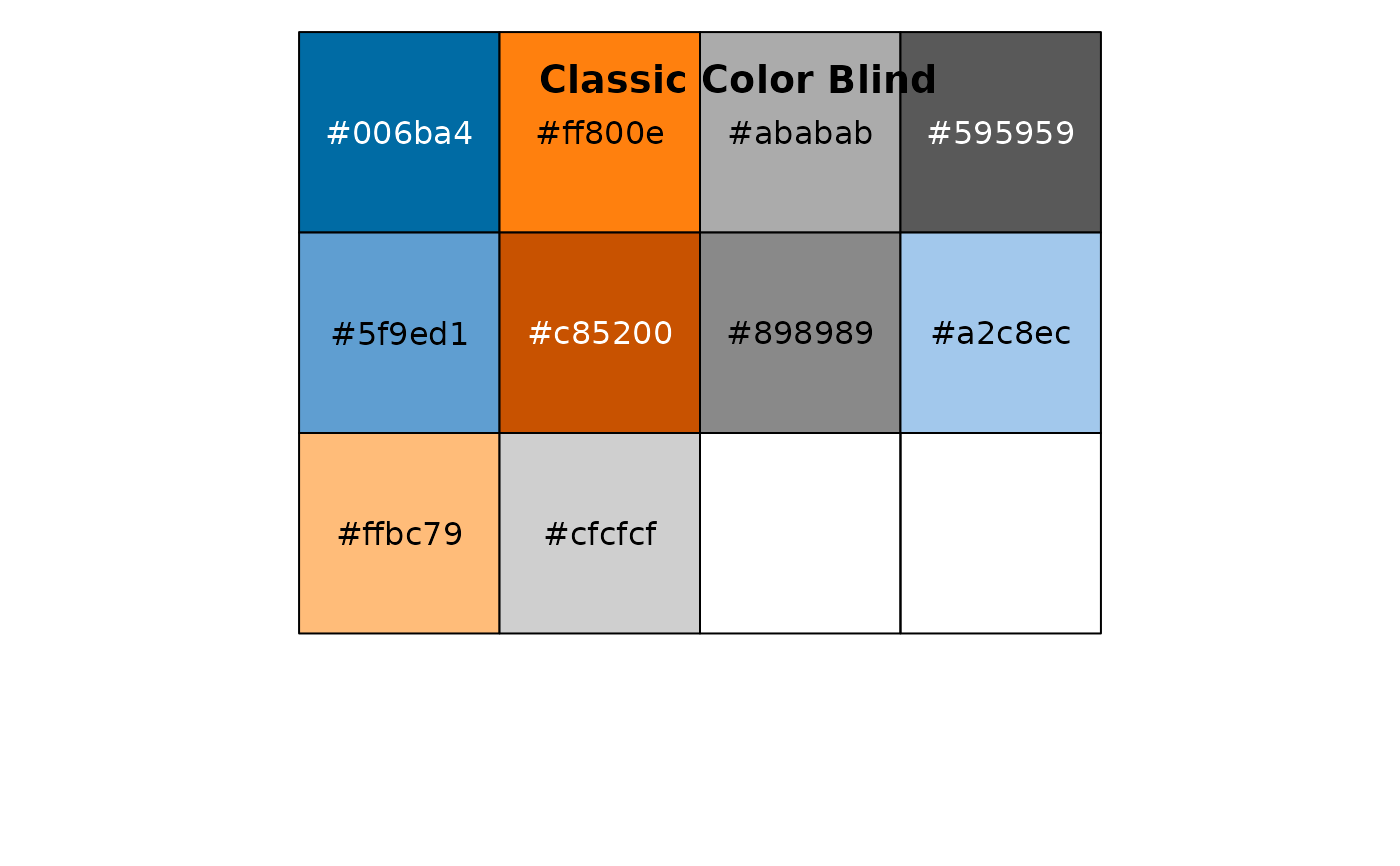
- Generic tweaks – Default figure size and resolution, color palette (Tableau colorblind), and plot spines.
- Text – Custom font (must be installed on your system), font size, title location and style, and size of axis labels/ticks.
- Legend – Location and the number of data points representing a single item.
- Grid – Always show the grid as a light gray dotted line behind the chart contents.
- Chart type specific tweaks – Default width of a line in a line chart, and including markers.
Paste the following into your .mplstyle file:
# Generic figure tweaks
figure.figsize: 10, 6
figure.dpi: 125
savefig.dpi: 300
savefig.bbox: tight
axes.prop_cycle: cycler("color", ["006ba4", "ff800e", "ababab", "595959", "5f9ed1", "c85200", "898989", "a2c8ec", "ffbc79", "cfcfcf"])
axes.spines.top: False
axes.spines.right: False

# Text
font.size: 14
font.family: sans-serif
font.sans-serif: IBM Plex Sans
axes.titlesize: 20
axes.titleweight: bold
axes.titlelocation: left
axes.labelsize: large
xtick.labelsize: medium
ytick.labelsize: medium

# Legend
legend.loc: "upper right"
legend.numpoints: 3
legend.scatterpoints: 3

# Grid
axes.grid: True
axes.axisbelow: True
grid.color: "#d3d3d3"
grid.linestyle: :
grid.linewidth: 1.0

# Line chart only
lines.linewidth: 3
lines.marker: o
lines.markersize: 8
So, how can you reference this file in Python?
A Superb-Looking Example
You only need to add one line of code to use your custom theme:
You only need to add one line of code to use your custom theme:
plt.style.use("custom.mplstyle")A typical place to do so is right after importing Matplotlib. That's not a requirement, just a best practice.
This is what your charts will look like now:
plot_bar()
plot_line()

Identical code, but a night and day visual difference, to say at least.
How to Make Your Custom Matplotlib Theme Available Globally
Bringing the mplstyle file to every new project isn't a huge inconvenience, but you can do better.
What "better" means is making the custom stylesheet available globally, or at least inside a virtual environment.
Start by finding out where Matplotlib is installed:
mpl.__file__
You need the entire path without the __init__.py part.
Assuming you're in a notebook environment, run the following command (after replacing the path) to copy the mplstyle file to Matplotlib's style library directory:
!cp custom.mplstyle /Users/dradecic/miniforge3/envs/py/lib/python3.11/site-packages/matplotlib/mpl-data/stylelib/custom-style.mplstyleNote that I've renamed the file.
If you're not in a notebook environment, just omit the exclamation at the start and run the command from the console.
Anyhow, after restarting the kernel, you should see your stylesheet listed:
import matplotlib.pyplot as plt

plt.style.available
You can now reference it from any script or notebook running in the virtual environment:
plt.style.use("custom-style")To demonstrate, I've created a new chart in a separate notebook. The data it shows is completely arbitrary.
The important thing is that the custom theme works:
import matplotlib.pyplot as plt
plt.style.use("custom-style")

x = [2019, 2020, 2021, 2022, 2023, 2024]

plt.plot(x, [100, 125, 200, 150, 225, 250])
plt.plot(x, [150, 220, 250, 300, 200, 150])
plt.plot(x, [200, 150, 275, 175, 250, 300])
plt.title("Custom Styles Demonstration Chart", y=1.06)

plt.show()
And there it is – a completely custom visualization style just one line of code away.
Wrapping up
To conclude, default Data Visualization themes suck.
You should do everything in your power to make your visuals stand out and capture attention. If you fail to do so, the quality of your message won't matter. No one will look at it for more than a second. No one will share it.
Custom style sheets in Matplotlib are a great way to capture attention.
You only have to write your theme once, and then use it anywhere with one additional line of code. It's a lot less friction than pasting dozens of rcParams to every Python script or notebook.
Which style tweaks do you typically include in your visualizations? Let me know in the comment section below.
Originally published at https://darioradecic.substack.com.
